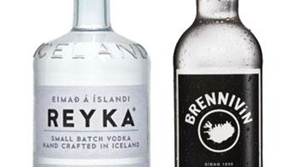
A good font can make all the difference, a lesson makers of Iceland’s spirits have taken to heart.
August 13 2015 6:35 PM EST
By continuing to use our site, you agree to our Privacy Policy and Terms of Use.

Brennivín, an aquavit with an iconic label, owes its distinction to a stark black-and-white palette and plain type. There’s also Reyka, a vodka that eschews frosted geese for an elegantly minimalistic font.
The simple graphic approach doesn’t extend to everything in Iceland (the packaging for the popular candy Hraun is dreadful), but it seems indicative of the country as a whole — uncluttered, stark, clean. Brennivín recently went through a minor update, courtesy of the New York–based Icelandic designer Hjalti Karlsson, who ditched the green bottle for a clear one and reinstated the Vestmannaeyjar islands to the map that adorns the label.
“I’ve always liked the label because it’s almost underdesigned,” Karlsson says. “It’s been around since 1935, when Prohibition was still partly in force. Word is, it was made to look like medicine to prevent people from buying it.”
That’s the kind of medicine we like.